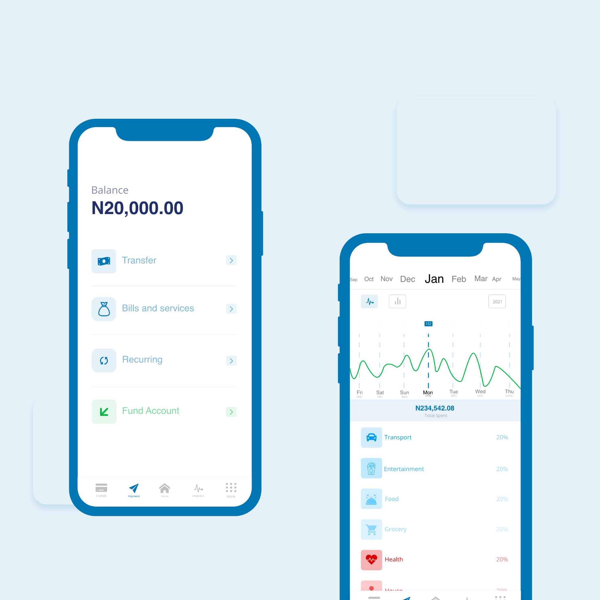
Butterfly App

Image

Butterfly

Product Design

We are creating a borderless experience for wealth management through our savings, investment and pension marketplace.

What I did

  • Ux/Ui Design
  • Visual design
  • Interaction design
  • Illustration
  • Animation

Visit Website

Description

Butterfly is a borderless marketplace for savings investment and pension. We are creating a borderless experience for wealth management through our savings, investment and pension. You can save individually or as a group through our various savings products. We use technologies like auto pilot to remove the hustle of trying to work out the best savings or investment option available for you. Using artificial intelligence, we are able to calculate the best savings and investment option for your consideration

Challenges

The concept of saving is not new, it’s just tied very heavily to banking and banks. Which people have been using for ages. People are familiar with terms like ‘deposit’, ‘withdrawal’, ‘transaction’ and ‘interest’. When people think of money, they think of banks.

Solution

My task was to design something new. Something that fits seamlessly into the user’s life, but still relies on the way users currently understand money and all the bank-y things associated with it. And incorporate a marketplace where users can pick from different savings option of their choice


User Flow

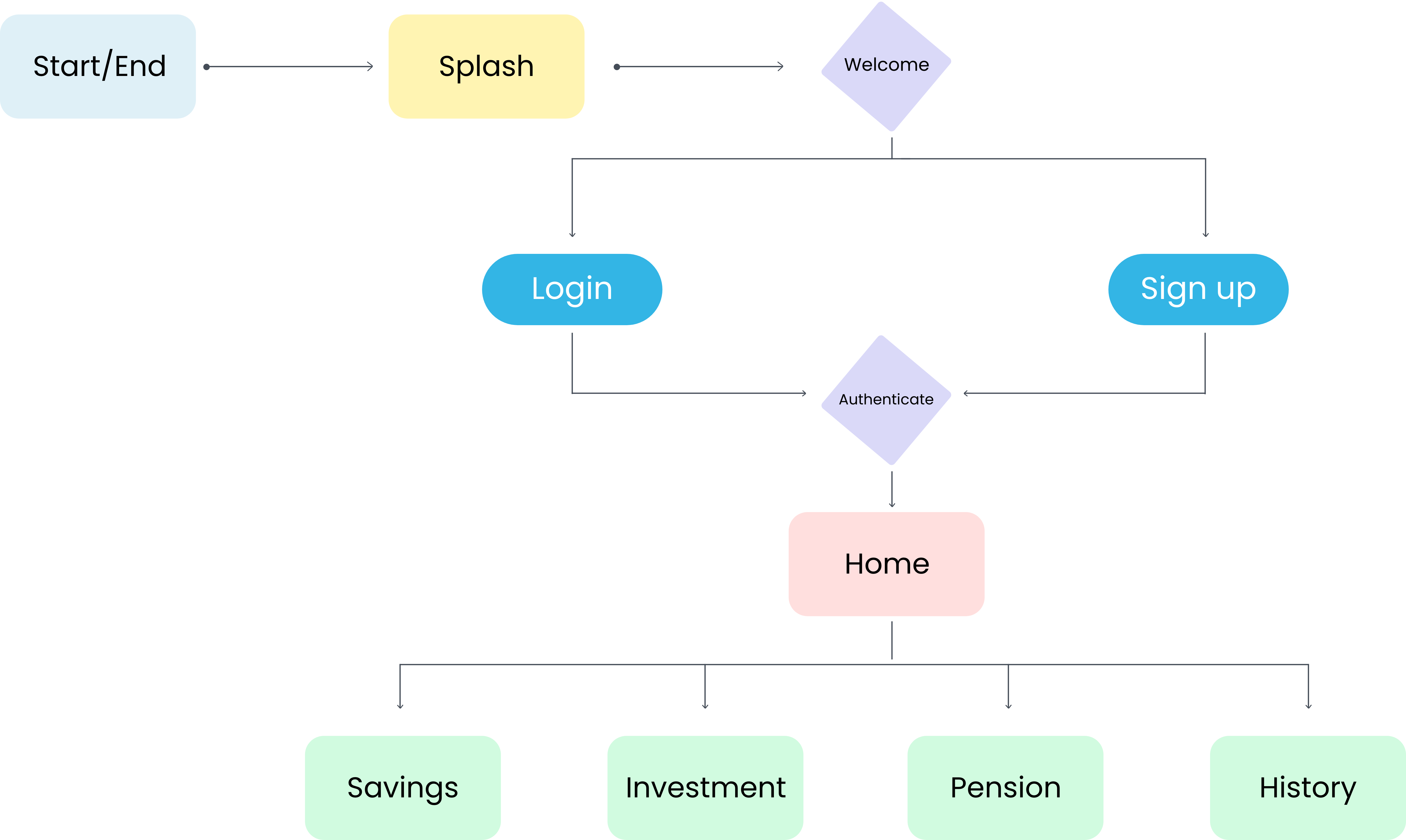
The user flow presents an overall picture and gives an opportunity to create a more seamless user experience. The user flow highlights are entries and exits, how the system acts and its connection with the users interactions.

Mind Map

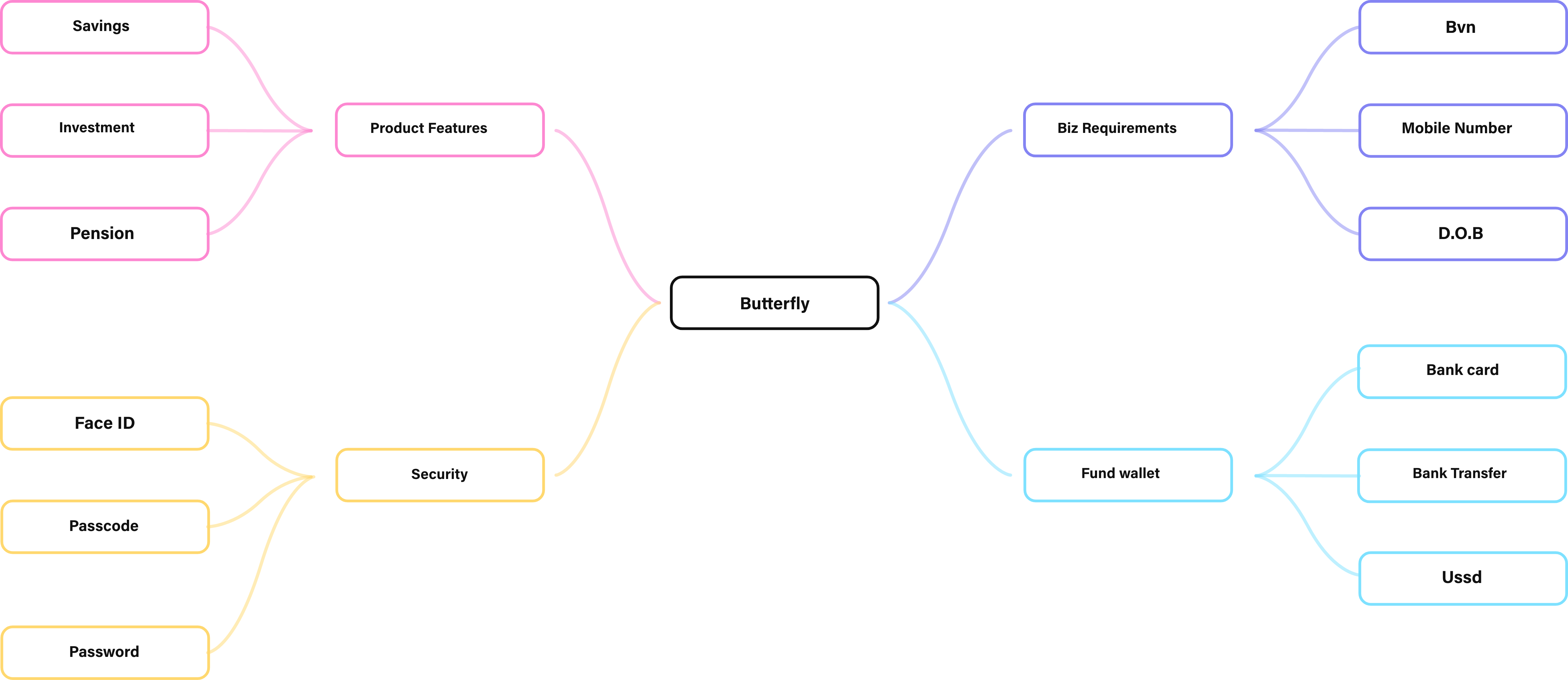
I created the mind map that was used to help in planning and organising my thinking before i started writing or getting stuck in the project. This is because i use the technique to develop all my ideas and see where they relate to each other before deciding the best way to go about the task at hand.

Wireframe

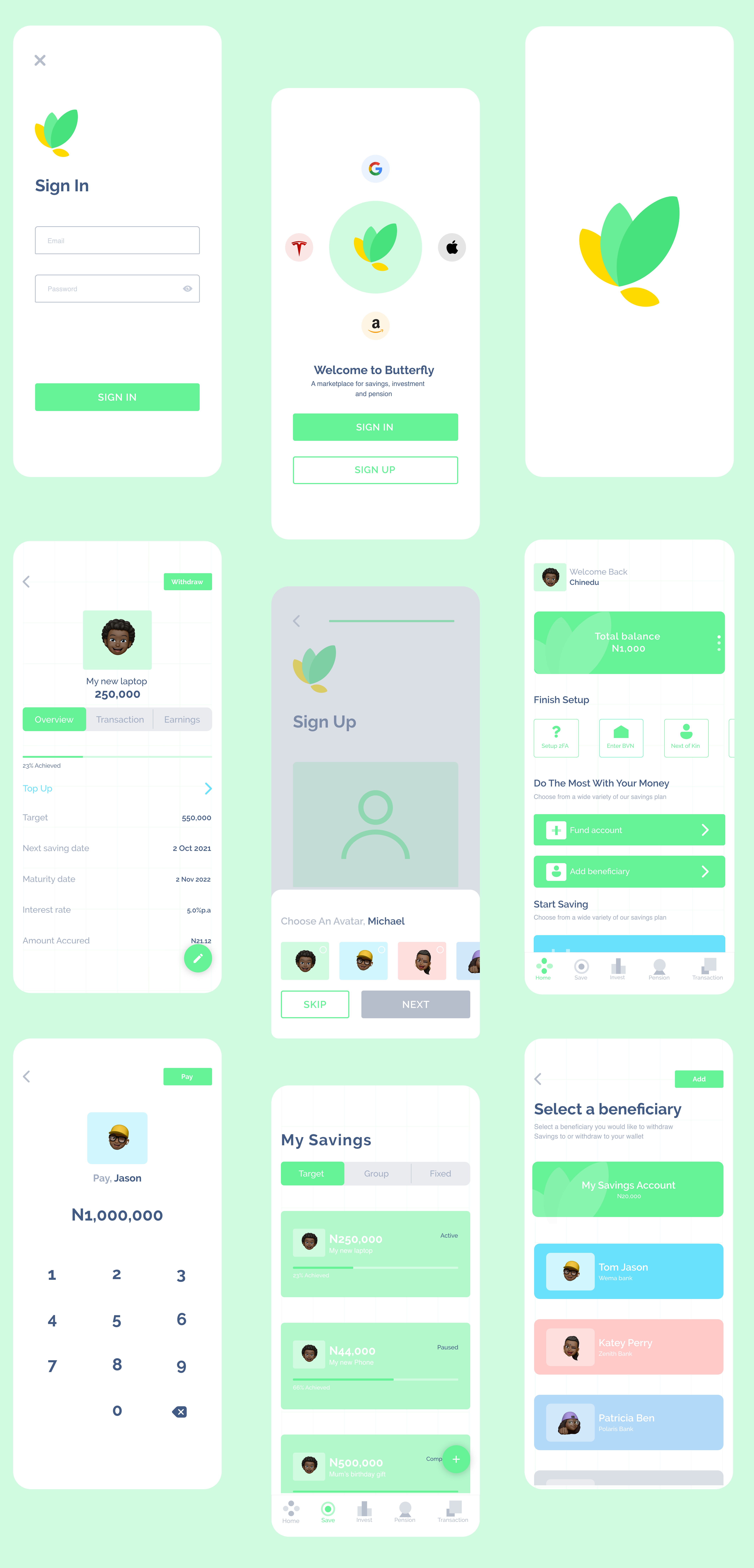
The reason for the wireframe was to help determine which elements should be included on each page, and which functionality traits need to be set in place for each element

Ui Components

The Ui components were created in mind to spice up the user interface and boost interactivity in the user interface, providing touchpoints for the user as they navigate their way around

Extra Elements

Some extra elements were put into consideration and finally incorporated with the user interface to spice things up

Icongraphy

Our list of custom made icons are a visual language used to represent features, functionality, or content. Our icons are simple, visual elements that are recognized and understood immediately

Navigation Icons

Savings Icons

Extra Icons

Animated Icons

To give an intuitive feel and a clear interaction i further ahead went to animate the icon to allow user know and understand when an action is taken, and how the icon changes its different stage.

Typography

The lettering are designed in such a hierarchical manner that the most significant words are presented with the best effect to guide users.

Color

The Brand Colour Psychology shows the idea behind the colours used on the brand logo. Every colour passes a message to the Brand's audience. The Butterfly brand is an AI savings and investment platform. Hence the use of the colours below

  • Growth
  • Hope
  • Life
  • prosperity

Pixel Perfect User interface


More Works

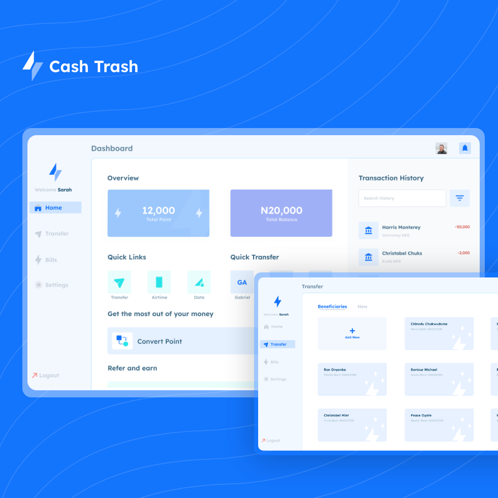
Read some of my other case studies and "Send me an email to work with you"