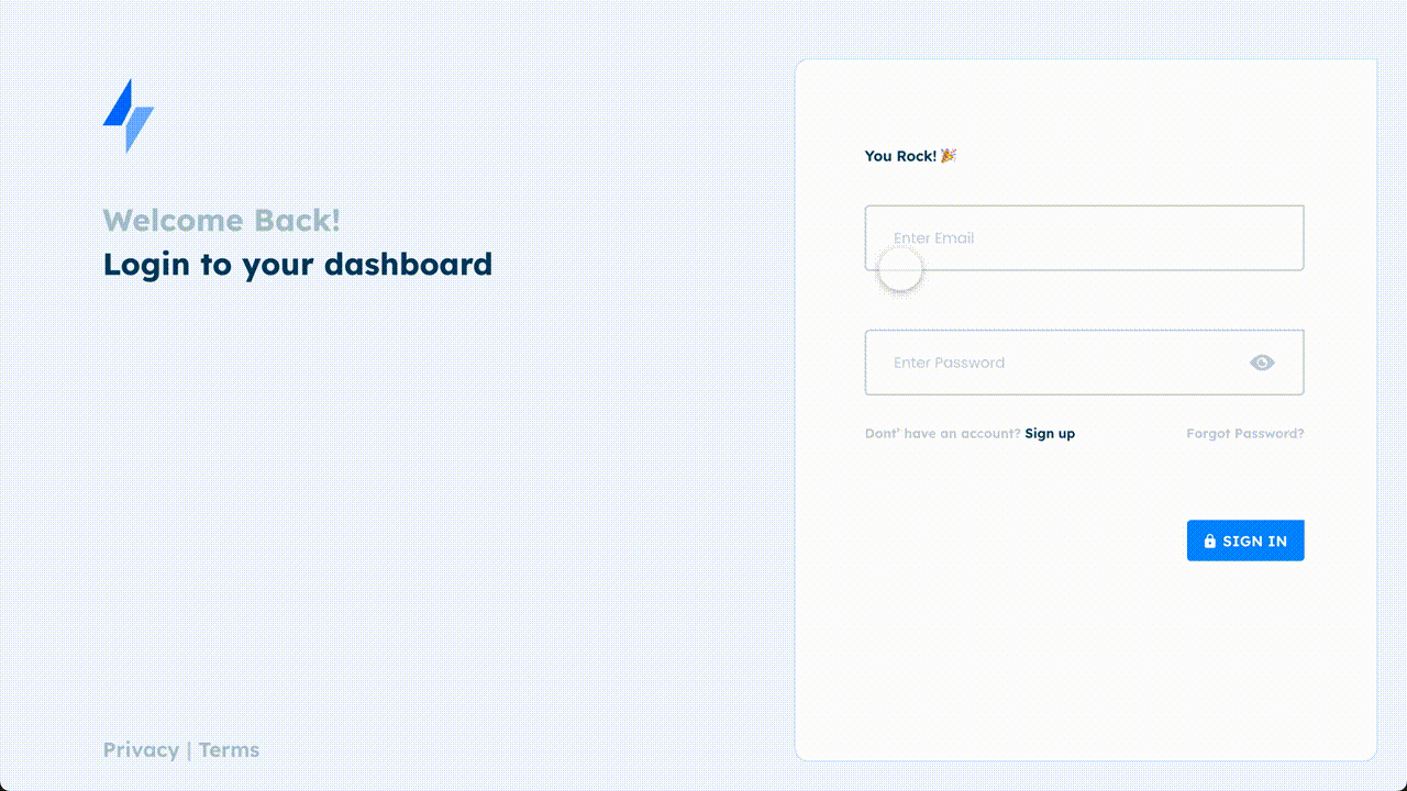
Task 1: Sign Up
- 82% of users Found it easy to navigate from Sign in to sign up
- 92% of user said the signup process is short and concise
- 85% of users liked the visual design and content heiracy, leaving the bounce rate at 25%
Product Design
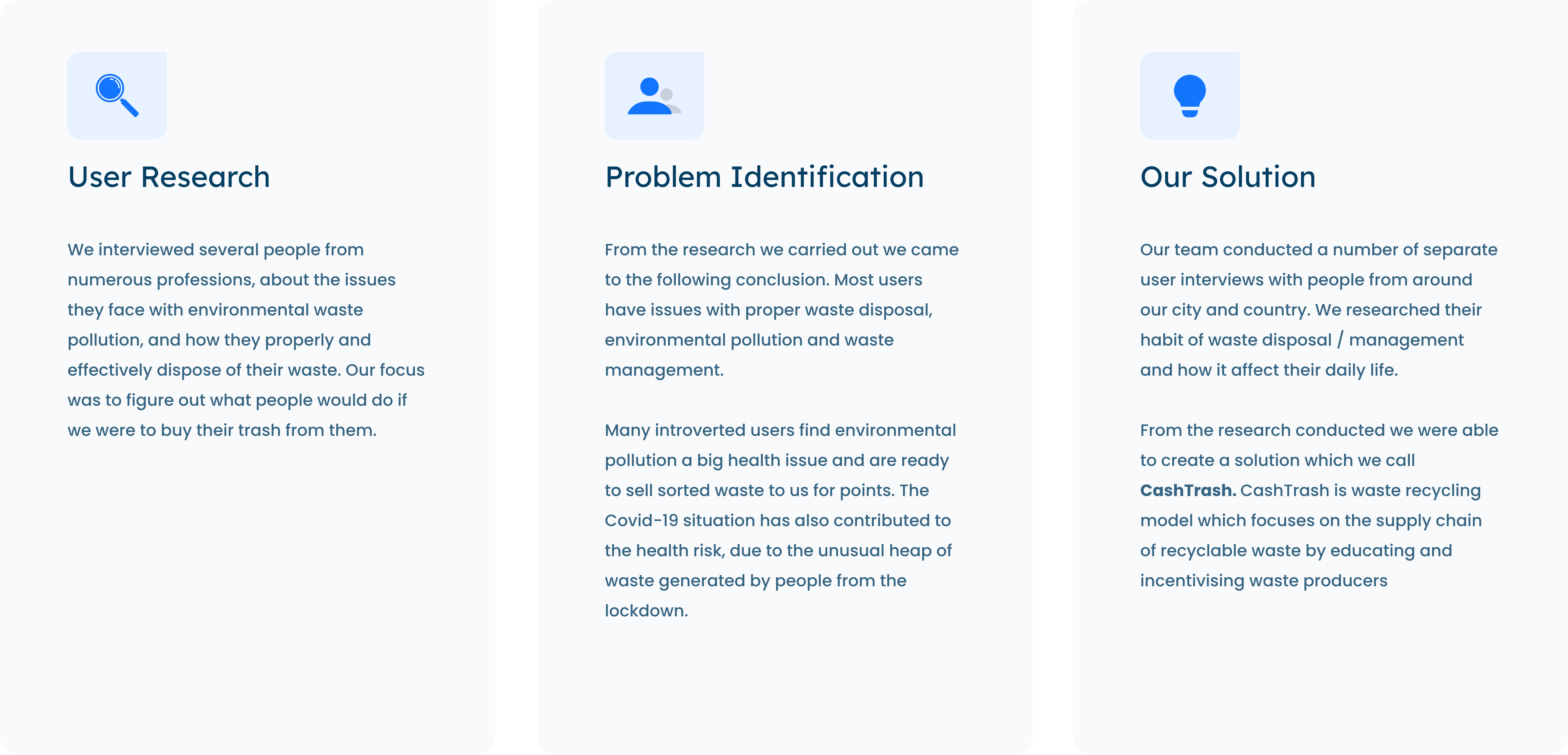
We focus on the masses and how to incentivize waste management in the community.
Cash trash is waste recycling model which focuses on the supply chain of recyclable waste by educating and incentivizing waste producers
Waste Producers do not have proper orientation (education) on how to effectively sort and hence monetize their waste. Waste Producers do not have proper orientation (education) on how to effectively sort and hence monetize their waste.
Before starting the project i and the team met with the stakeholders to ask some certain questions that would drive our thoughts towards the project. Here are a few of the question that were asked
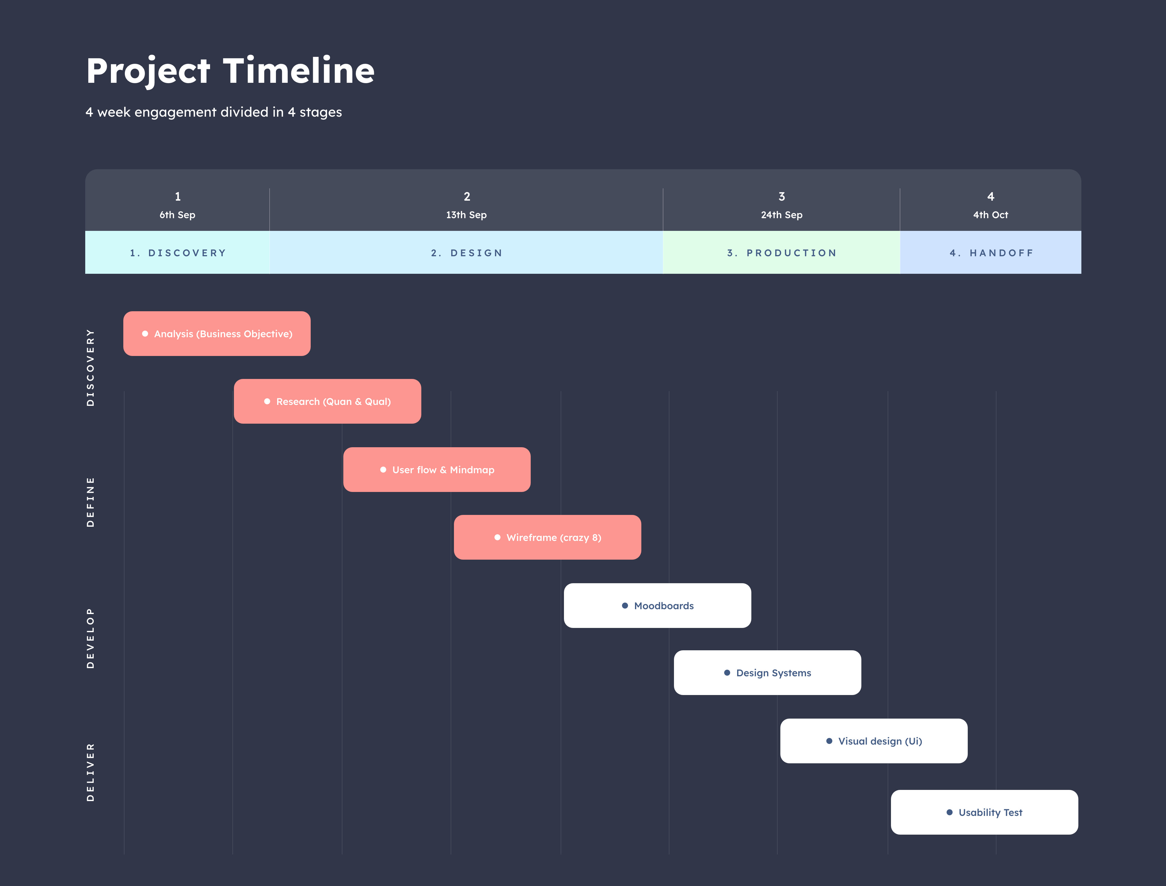
After carefully analysing the business problem and getting the answers to the key questions. My team and i were able to proceed into researching more about our users and understanding their pain points, which we divided into two phase namely;
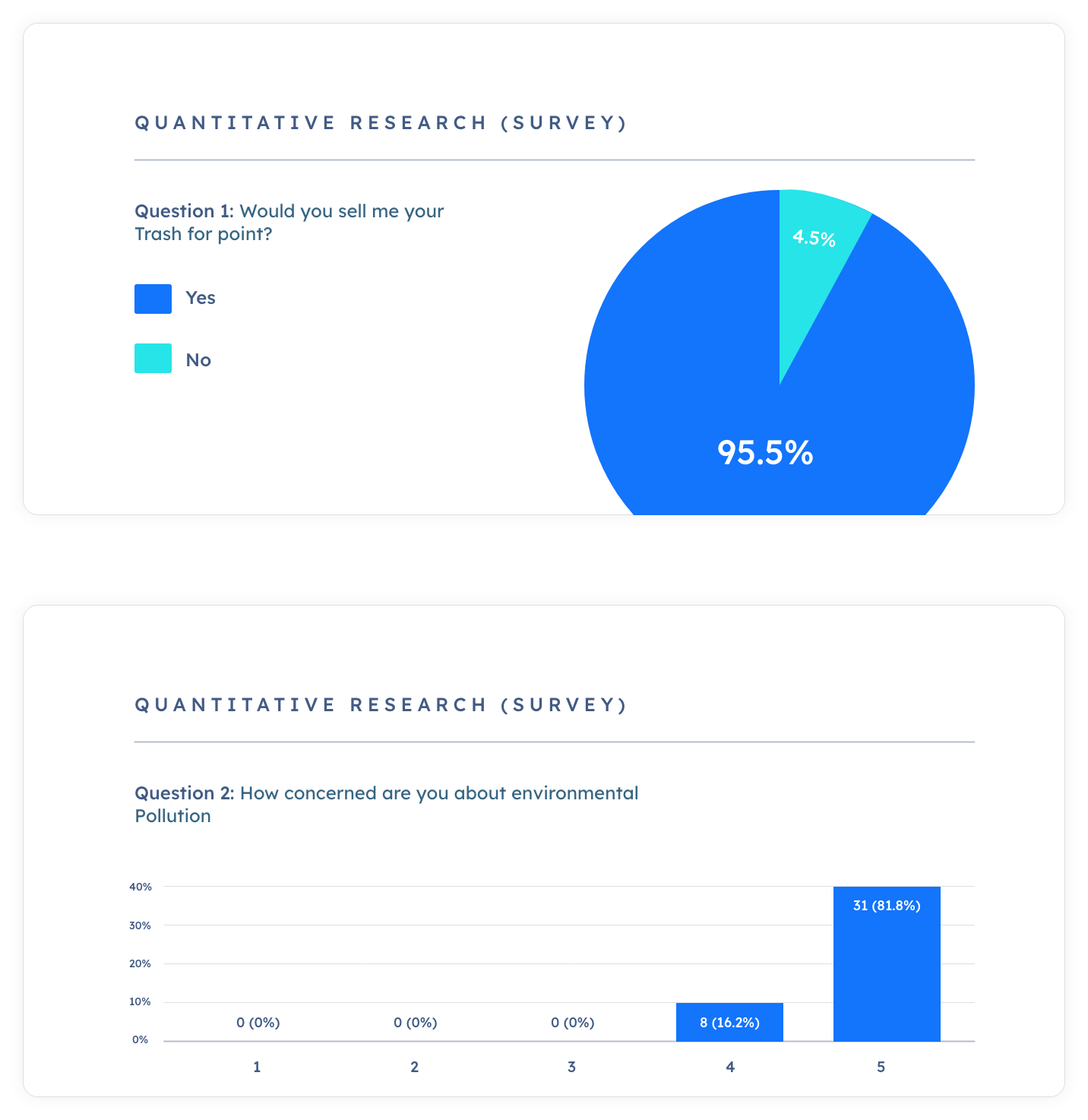
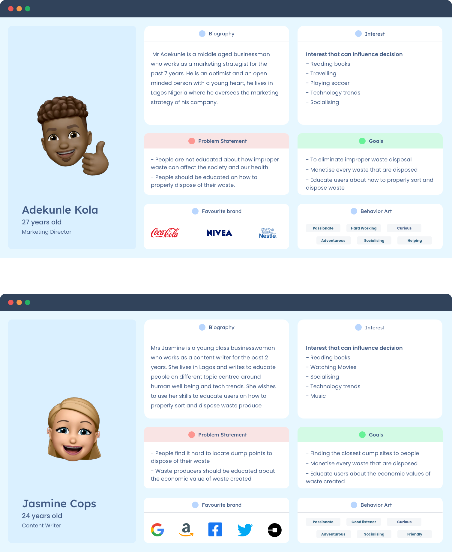
Once i had conducted my survey and interviewed some users within the age group of 18 - 45, i was able to group the data i got from the surveys and user interviews into sections and build out a persona, centered around user statements, interest, goals and problem statement, Which guided me into knowing what users i am building for
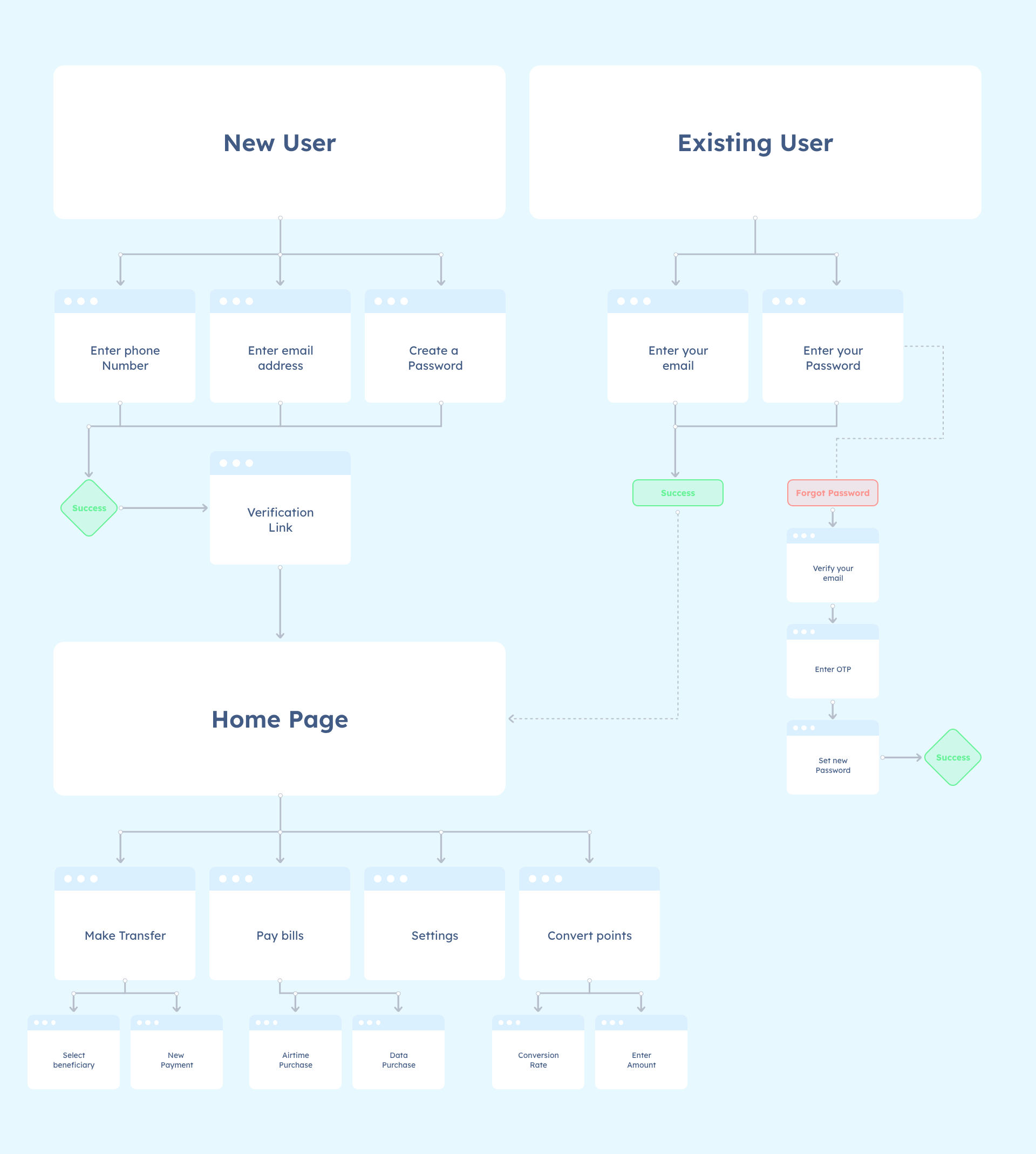
After i had collated my data from the user surveys, user interviews, and user persona and i was certain about my target audience and what their pain point is. I and my team went into an ideation phase trying to plan and structure the architecture of the system and how best it would fit user needs
My team and i did alot of brain storming and iteration session on how best to structure the user flow for a seemless experience. Using different Personas to make sure we don't leave out some category of people.
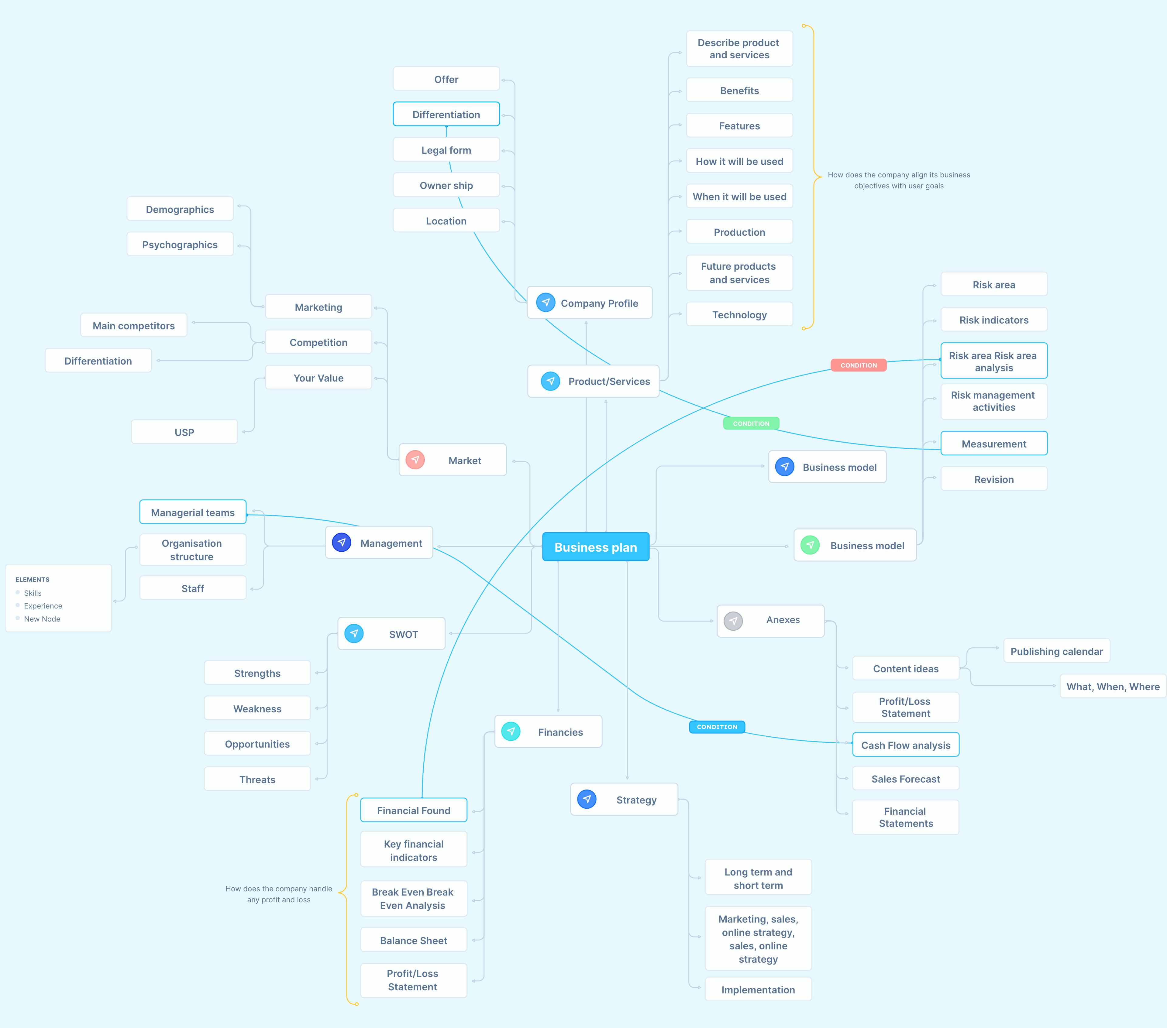
Iterating and brainstorming with the team opened our mind to new ideas and possibilities and as such we picked our pen and paper and started a mind map session with the team and its stakeholder jotting down each new possibilities we could think of.
With the information i gathered, I created several sketches with different layouts, and ended up with these sketches, where i focused on planning out a design system, with reusable components, with the goal of making it a completely human centered design.
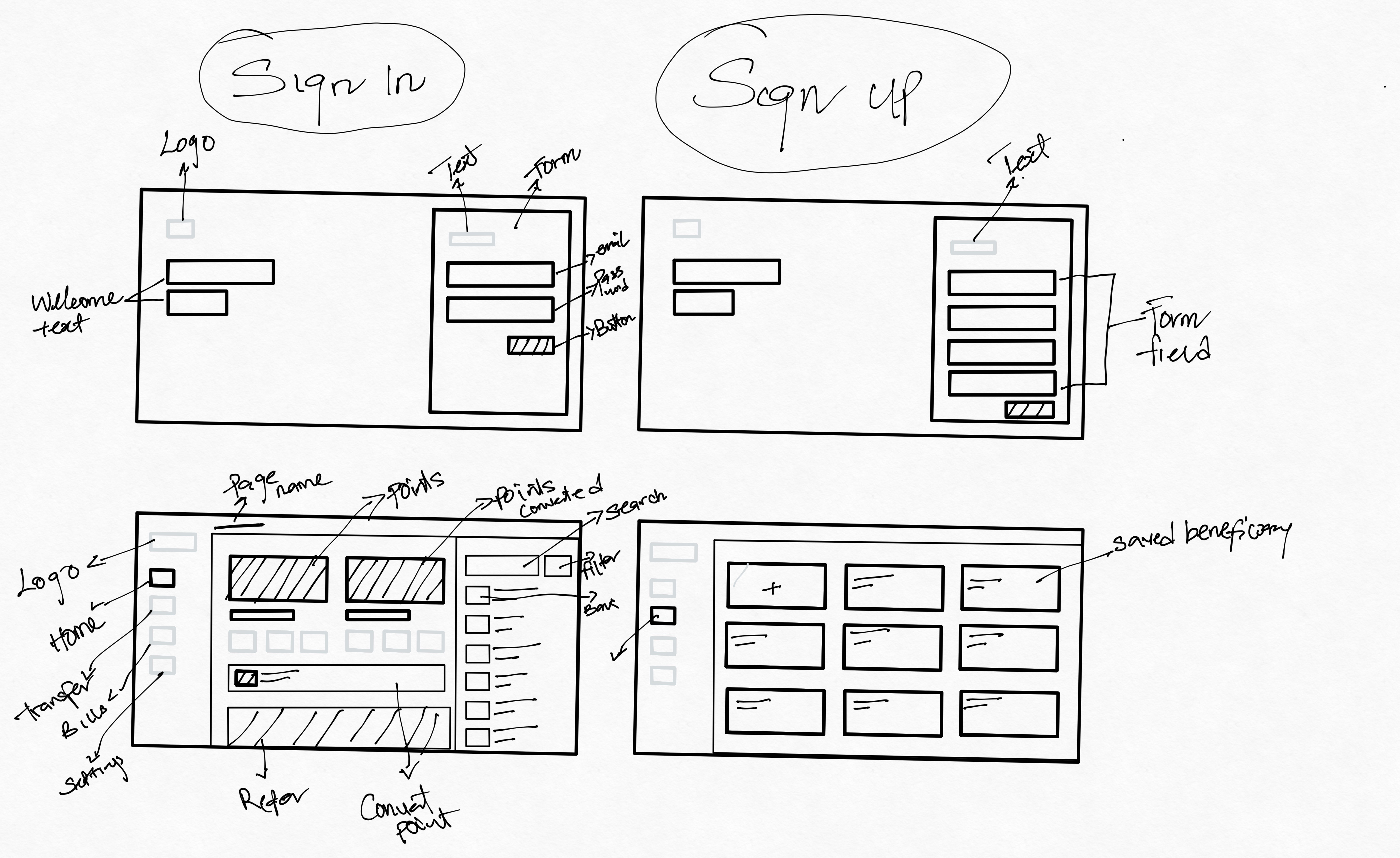
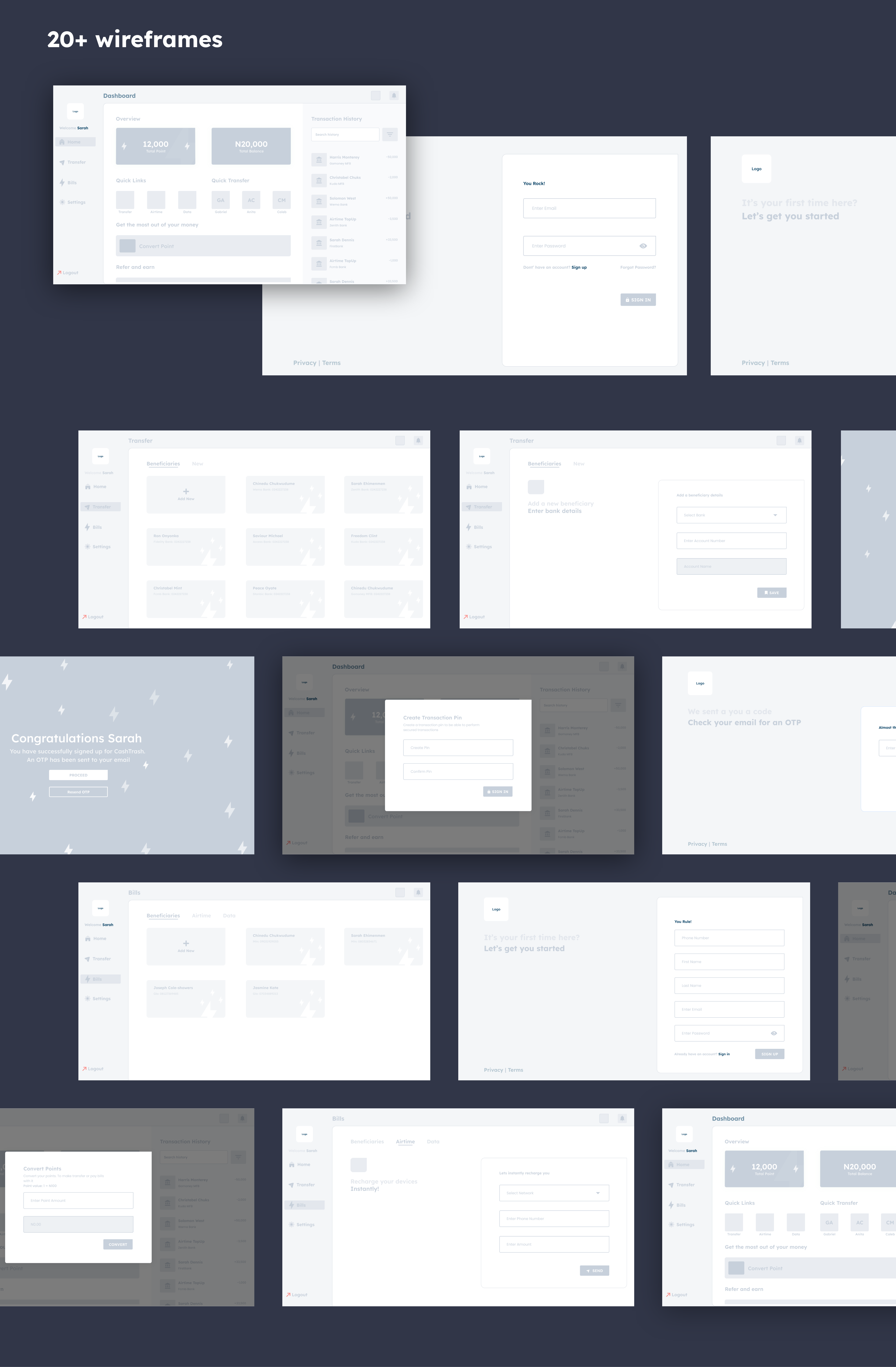
Sketching on a paper wasnt the only way to ideate for me i had to take the extra step. So after sketching out the design on a pen and paper(ipad) i proceeded into building out the Low-Fidelity wireframe into testable design that i shared with the team and got feedback
Putting together a design system was one of the most important step in our product development, because it created uniformity(Consistency) amongts our design, users and developers. Our design system cut across colors, typography, iconograpy, illustration, the interaction system and more. below is how I break down design into component, and provide proper documentations on the use of different components.
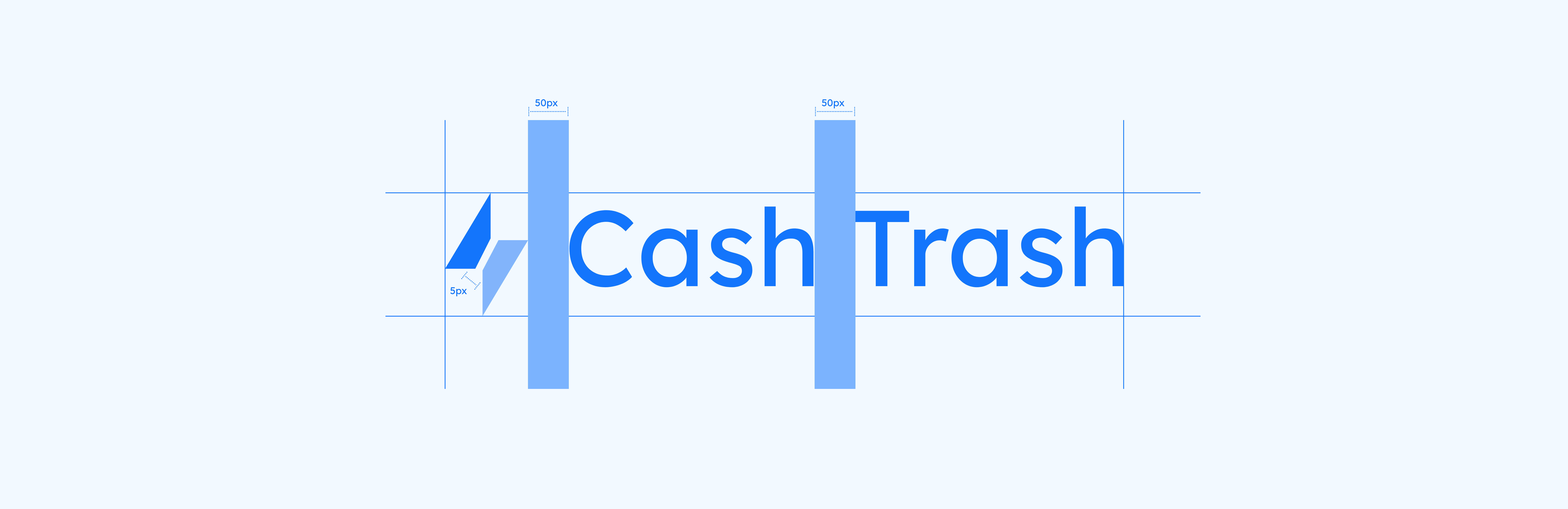
Optical kerning, refined weight, and defined clearspace, as well as well-delineated placement in relation to other content, all help to make our logo as instantly recognizable as possible at all sizes and in all contexts.
Our logo is based on simple shapes. It is carefully constructed to maintain ownable characteristics while allowing for perfect legibility at any size on any application. Clearspace around the logo is equal
Our unique icon usage ranging from curved edges to rounded icon potrays our brand uniqueness with a clear understanding of the logo should be used
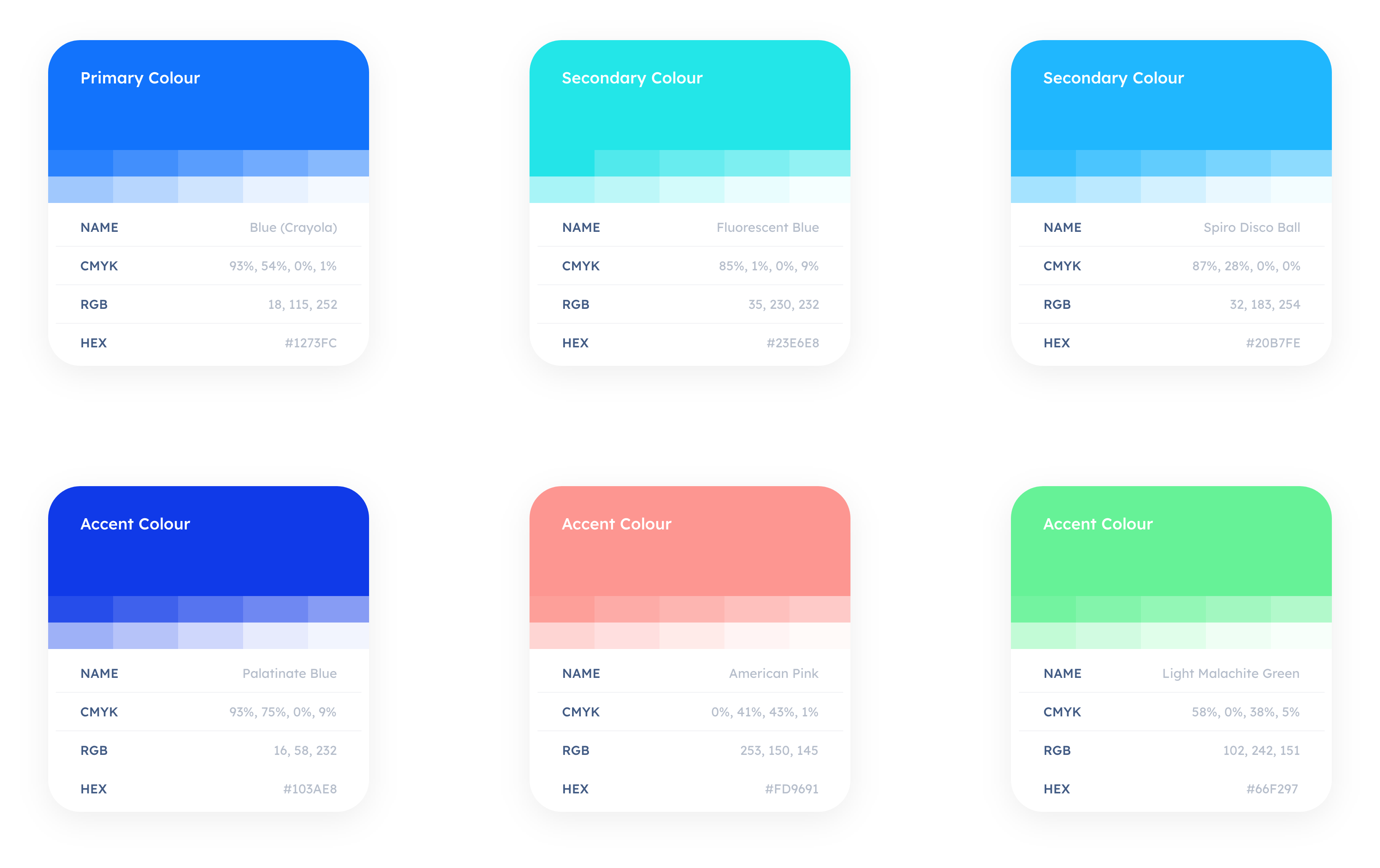
Our Color theory is a set of rules and guidelines which we use to communicate with users through appealing color schemes in our visual interfaces. The theory includes
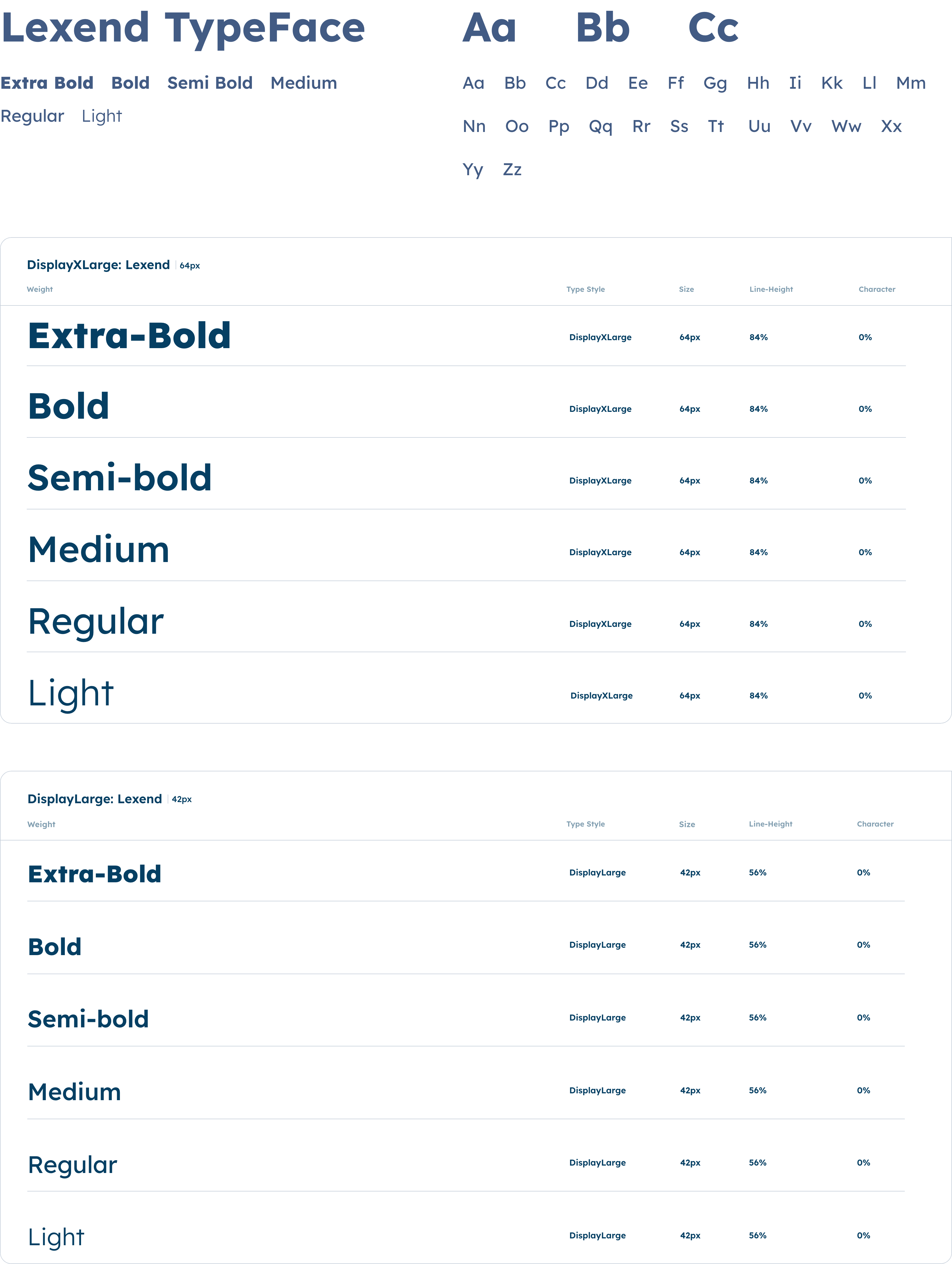
Our typography is as unique and easy to read as we are, we focus on legibility, simplicity and clearspaces to maximize its impact across all applications while keeping it easy to read.
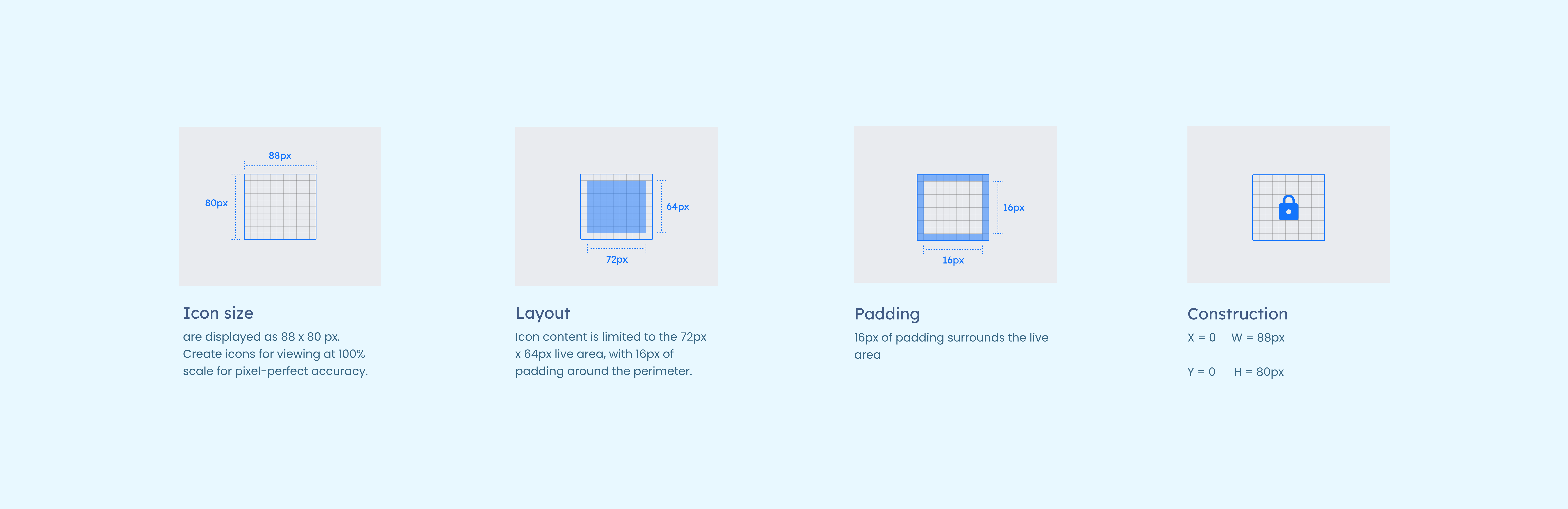
The iconography System icons are designed to be simple, modern, friendly, and sometimes quirky. Each icon is reduced to its minimal form, expressing essential characteristic
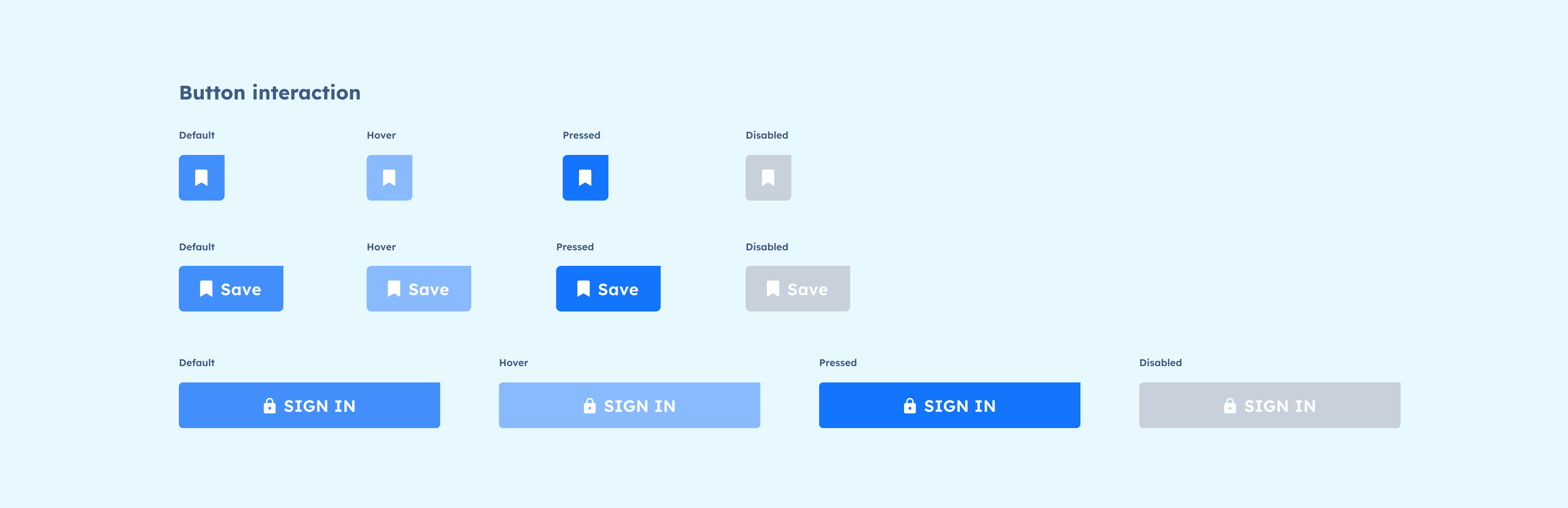
The Interaction states communicate the status of an element in the interface, establish confidence once an action is taken, and suggest the ability (or inability) to interact with the element. Some few of our interation state "for the purpose of showcasing the portfolio" are
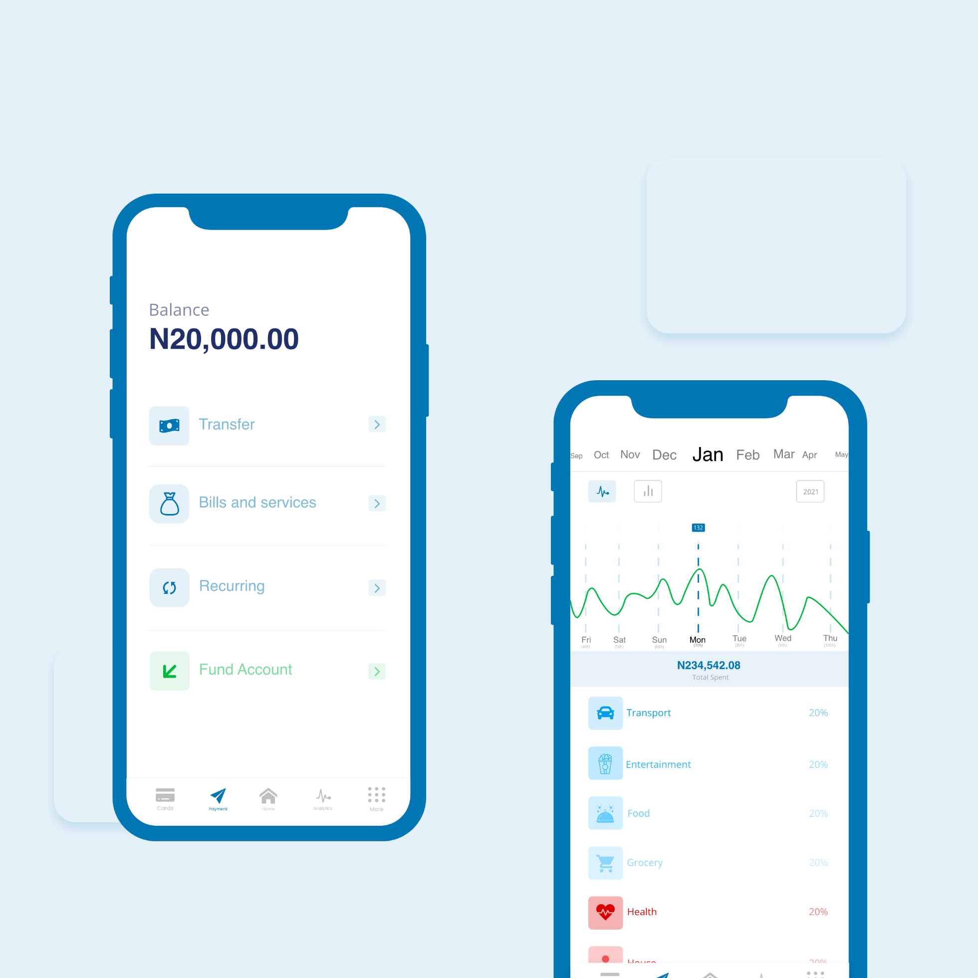
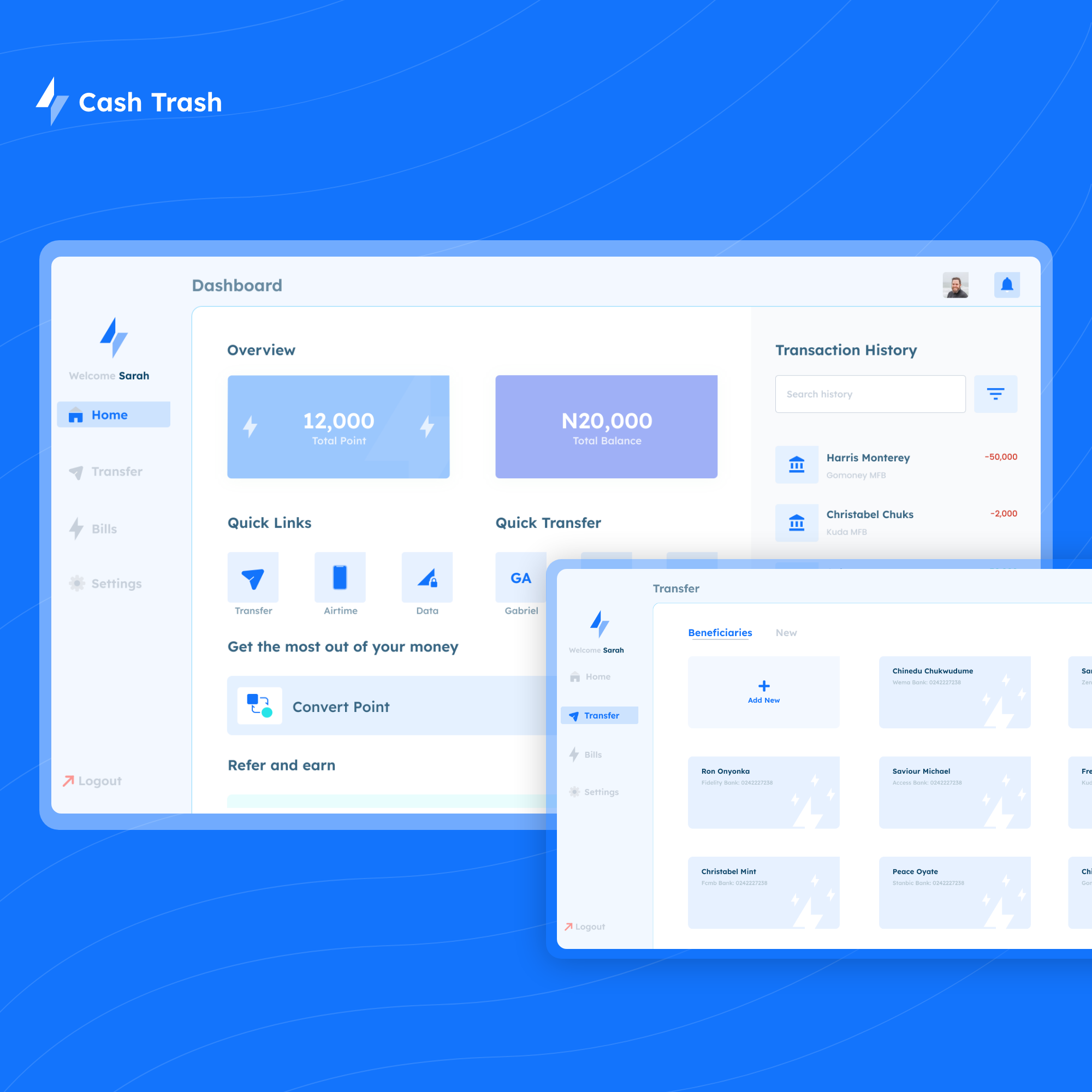
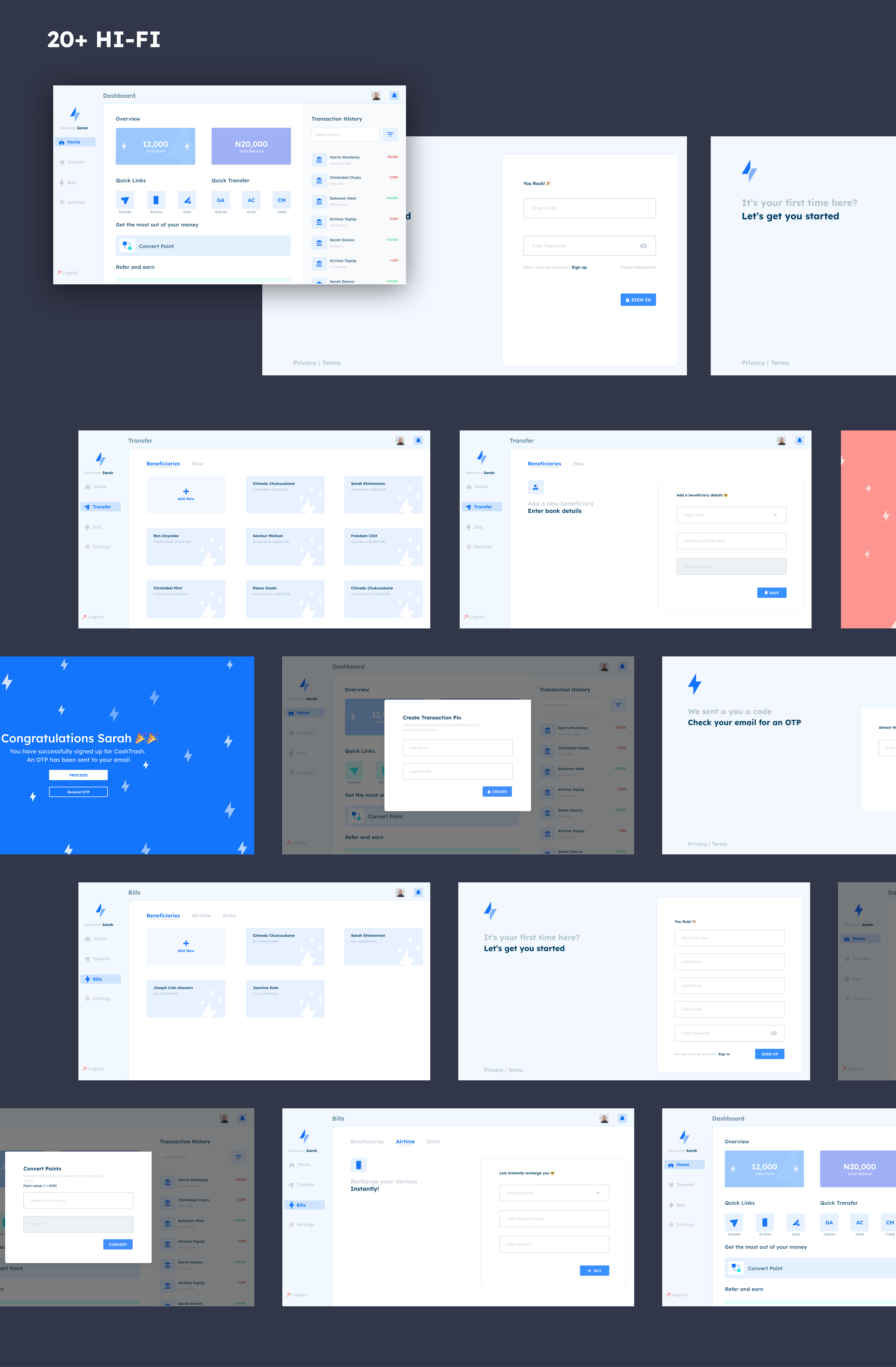
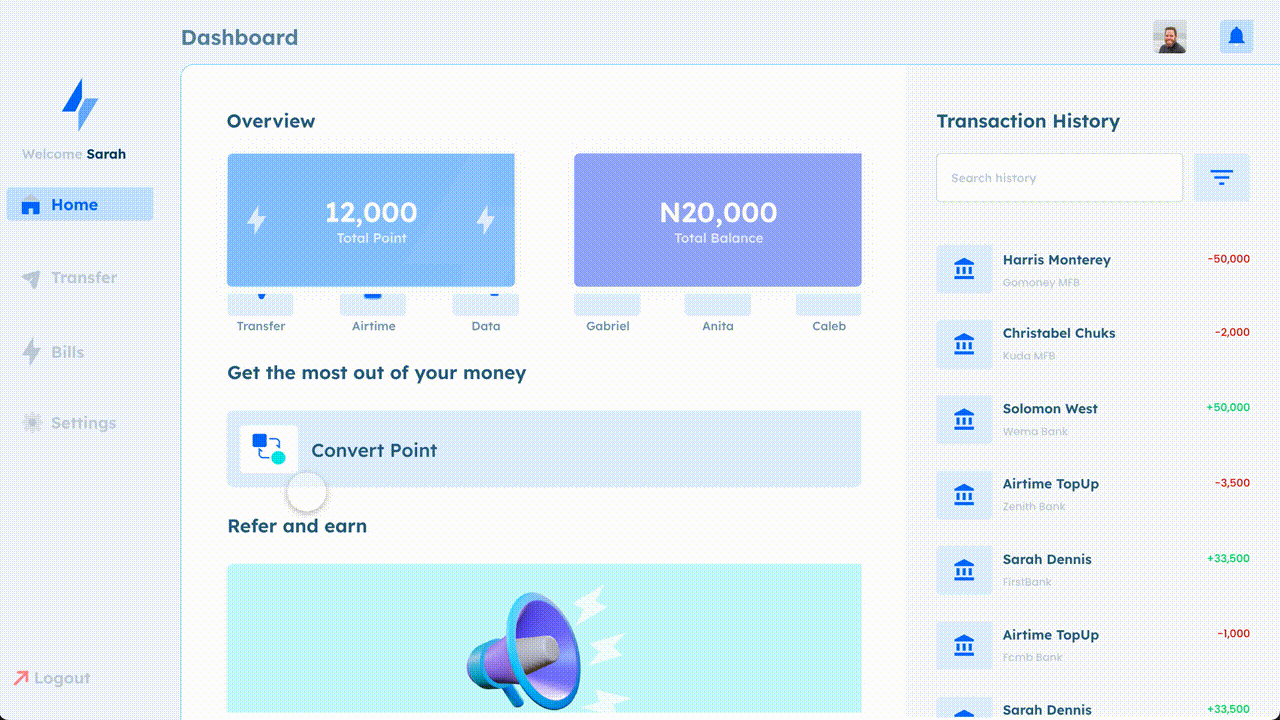
After gradually collating, creating and organizing all the data from the research and ideation phase we concluded on how the Hi-Fidelity would look using the CashTrash Blue as our primary color and Lexend as our lead text
No product is ready for shipping without testing, my team and i organised a usability test session with different users from the age group of 18 - 45 years and broke it down into modules, asking users some question and giving them task to complete within a certain period to understand the perecentage of User bounce rate
Read some of my other case studies and "Send me an email to work with you"